Fishes

Wednesday, 26 September 2012

More Previous Student Work!


 Send Me On My Way - Rusted Root (2011-2012)
            

I really love this music video because it creates such a great and happy feeling when watching it. This kind of emotional response is my main aim when creating my own music video. Although this video has no performance or narrative like I plan for mine, it really makes you feel. This video also relies heavily on editing which I think seriously makes up for the lack of any real content. The use of colour manipulation at the beginning, by using a black and white effect when the music isn't playing really shows how happy the music really is, and how happy everyone within the music video is.

I'm mainly posting this because of the emotional response and the happy feelings you get from listening and watching the music video (especially the old man, he's brilliant). If I can create some form of response like I had to this music video, then I'd feel more than happy enough (literally) :)


Previous Student Work


The XX - Crystal Castles (2011-2012) 


Strengths
-Variety of shot types used, e.g, close up on guitars and lips, high canted angle of lead girl, birds eye view of lead singers lying on the floor
-The editing speed matched the pace of the song, especially at the beginning of the video with the nature shots and drum beat
-The performance/concept gelled well with the genre of song
-Interesting use of parallel editing at 0:11 with guitars being put on

Weaknesses
-Lip syncing is slightly out or not obvious, e.g. on the close up of the lips singing, should be more emphasized.
-Some shaky camera work 
-Quality of the footage isn't brilliant, some pixilation

On the whole, I really like the music video. It's very in-keeping with it's genre, moody and having the video set in a forest on a cloudy day reflects the music very well. I think the band are costumed well to the style of their music also, having them all in black and the girl in a white shirt shows the unity of the band and the music they represent. What I might do differently in my own music video, or be aware of, is the light quality that affects the quality of the footage, as some scenes are slightly compromised by this. Also the lip-syncing in this video isn't great, so I'll get my band to actually learn the lyrics and sing out loud to hopefully prevent this. I also loved how the band were actually playing (or looked like they were) playing the right music for the song, shown in the close ups. This is something else I'll consider greatly when filming. 

Friday, 21 September 2012

Textual Analysis - Katy Perry, Last Friday Night


So after reviewing my blog, I decdied there wasn't much textual analysis of music videos as I would of liked, so I've decided to analysis a few more music videos. I've decided to look at Katy Perry - Last Friday Night, as this is what I would class as you're run of the mill pop music video, but with a strong sub-genre of comedy.

Camerawork
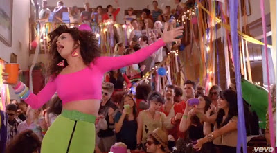
There are many close ups of our artist, Katy Perry from the very beginning, which is a key aspect of Goodwin's Six, of her both performing to the camera and playing out her narrative. A lot of these closeups are for comical effect as Katy Perry is playing a character called "Kathy". With these shots we can see the disgust on her face when discovering her messed up house and when having her 'mustache' waxed. Her facial expressions are purely for comical effect as they are outrageous and quite funny. There are also many midshots of her in her room both tidy and the morning after the party. This shows the contrast between time periods and could represent the transformation her character makes throughout the course of the music video. When she goes through her physical transformation of costume, hair and braces removed there is a large increase of mid to long shots of katy perry. This could be due to another one of Goodwin's Six, referring to voyeurism, as she now looks more attractive and desirable for a male audience. In contrast when she is in her 'nerd' outfit, there are many more close ups rather than mid or long shots, as a 'nerds' body is not necessarily desirable to the main male audience. The camera itself is very steady which is conventional for most pop music videos.


 Mid shot after the transformation- voyeurism

Close up before transformation- comical

Mid shot transformation through parallel editing- after

before

Editing
The editing pace of the music video is generally quite slow, considering the song is quite fast and upbeat. The pace does pick up a bit when the party moves to her house, and is mixed with lots of jump cuts between different acts. This could be the suggestion that our character could be drunk at this point, and is remembering the party is fragments, and there is a shot of her being sick. The only other time there are several obvious jump cuts is when she reveals her new look walking down the stairs. This again could be linked to Goodwin's voyeurism as it takes several seconds to move up each section of her body. There are some wave cross-fade transitions during which represents either a flashback to the night before and later on for the imagination of the geeky boy. During these imaginations there is also evidence of a green scene as both Katy and him are either in front of a volcano fighting the jock or a castle after winning his "damsel". I believe these locations have been chosen for the connotations of knights, heroism and damsels. 

wave/cross-fade transition

 Jump cuts between sections of her body - voyeurism


green scene - connotations of heroism


Mise En Scene
Costume: Katy at the beginning is dressed in very stereotypically nerdy clothes, a pink turtleneck jumper and dungarees. The fact that these two items have been selected together shows that the character has no idea or concept about fashion or 'looking good'. However, she predominately in pink which does suggest she has some femininity, which is revealed later on. To solidify her geek persona, she is wearing oversized glasses and an outside brace for her teeth, both incredibly stereotypical for this character type. Later on, she is wearing a tight bright green pencil skirt and a pink crop top. This is highly revealing in comparison to her earlier costume and suggests voyeurism. Her glasses and brace are also gone which suggests she wants to embrace her feminine side. Her only other outfit is when she is in the geeky boy's dream and she is dressed as a stereotypical medieval damsel. As she still has her brace and glasses on during these scenes, it suggests that this male character find her attractive regardless of her clothing; and is also for comical effect.
Setting: The main set is her and Rebecca's house, which is typical of most teenage parties. By using this kind of setting could be an attempt for the audience to relate to Katy situation and wish to be there with her partying. This also has a strong visual representation of the lyrics and visuals. The setting is also a message to the audience that everyone has fun! There is not a single character in the music video who, by the end, is not happy and show's a nice light hearted view to american teenage life.
Props: There aren't any main props involved, but the few we see being interacted with are all purely for comical effect. For example, the wax on the upper lip which she licks, the chicken fillets which Katy sniffs, an 'muscled' torso which is touched with extremely funny reactions, Just Dance and a saxophone used by a featuring musician.

Overral I love this music video as it's lighthearted and funny. Katy Perry takes the mickey out of herself, which is nice and refreshing to see in a music video. The comedy is used well and not thrust in your face and I think it's just generally a feel good song.

Here's the music video!


Previous Student Work


This music video was created by students in 2011, by 'The Summer Set - Punch-Drunk Love'


Strengths:
-Cutting on the beat constantly makes the video more interesting for the audience to watch
-Having the 'band' know the lyrics and song when they're playing their instruments
-Nice transitions between scenes, for example the dissolve at 0.56
-The use props, the 'American' red cups, to give the impression the band are in America is really good, and a nice touch
-The combination of narrative and performance was nicely done, and now the two interlinked with the band playing at the love interest's house
-A solid narrative which keeps the audience engaged

Weaknesses:
-The costumes look like they've had very little thought put into, and look just like ordinary people. 
-The lead singer's acting when lip-syncing isn't great, as he puts little into it when the pace and speed of the song suggests excitement, and he doesn't look very excited
-Limited use of camera angles or movement, which made the technical side of the video not as interesting

Overall, this music video is very good, there's no bad jerky camera moments or poor editing and I really like how they interlinked both narrative and performance at the love interests party. When making my own music video I shall take extra care that my band/singers put lots of effort when lip-syncing, the lack of effort in this music video is what lets it down in my opinion. I'll also pay extreme attention to detail when choosing costumes for my actors and 'band', as I want it to look as realistic as possible, rather than a few friends pretending to be a band.

Class Feedback and Idea's


So today I played my selected song, Up up up - Givers, to the class so I could get some feedback and ideas of what they thought and possibly help me with my music video concept.

 The majority of the class' ideas all revolved around an urban setting, happy atmosphere including friends, or includes lots of dancing. Lot's of ideas of seeing the band performing came up as well, which isn't an idea I'd first considered as I didn't know how I would fit with my original idea.

  A couple ideas that I really liked from the class is the idea of following a balloon that's rising in the air in an urban setting, then from the balloons point of view you can see different story lines within that urban setting/town taking place. All are happy, possibly seeing couples, first dates, kids on picnics with family, old people feeding ducks, ect. Then also you would have the band playing on top of the balloon, so the possibility of using green screen could be used during those scenes. Although I really like this idea, it's very similar to the original music video, which is what I wanted to stay far away from.

  Another Idea I really liked involved animation, with trees, flowers and animals talking to a man who had found himself in this 'alice and wonderland' world. Again, another great opportunity for green screen, which I like the idea of. This could also fit in well with my current idea, as when the couple go into the tent, they could find themselves in that fairy tale world, since I'd drawn a blank of where to go from that point on.

  My favourite idea from the class is probably the most simple. It consists of have a plain white room and having a variety of sizes of balls in there, from exercise balls, to footballs and down to bouncy ball bit balls. In this room, the original idea explains that there is two people in there playing with the balls and when they open a door, it "leads to civilization". I love the idea and how simple it is, although instead of using my couple, I'd probably use a characters to imitate the band, that way I could include a performance element into my music video which I would really love to do. Also, the possibility of exchanging balls for paint and having splashes of colour all over the white walls. 

 So, During moments within the music video you see clips of the band playing in a brightly coloured, splashed room of paint, performing to the camera. And during the 'crazy ending' (and possibly throughout the video as well) you could have the band splashing the paint over the walls, basically having an awesome time with the paint. If this idea is too impractical, you could use the balls like in the original idea OR you could completely fill the room with balloons and have the band play with those, instead. I really like this idea, and probably will use this white room balloon/paint idea to fill the gaps in my initial video idea!
  

Thursday, 20 September 2012

My Initial Idea For The Music Video


The song I'm considering for my music video is by the 'Givers', and here is a mind map of my initial ideas.


One Shot Music Video


Bruno Mars - The Lazy Song


 A one shot music video is when the whole video is filmed with one take. This would involve a huge amount of planning and preparation as if someone makes a mistake, the whole video must be refilmed from the beginning. This is why it is vital that the artist/band know all of their lyrics to lip synch in time and all the dancers know the routines perfectly.

I've chosen to look at Bruno Mars - The Lazy Song, as it's a catchy and upbeat little tune, which also must of had a serious amount of prep work before filming. The video is set in the living room or Bruno's house and consists of him, and five monkeys dancing to the camera. This video also follows a few of Goodwin's theories, such as a link between lyrics and visuals during,

"..throw my hand down my pants, because no one's gonna tell me I can't." 


and "Don't feel like picking up my phone"


The video also includes lots of close ups of Bruno; another key point to Goodwin's theory. Although, During the video (1.30) Bruno covers the camera lens with his hands, where a possible edit could of been made, technically making this not a one shot music video. But in saying this, through the gaps in his fingers you can see the monkeys/dancers leaving the scene.

Wednesday, 19 September 2012

Textual Analysis - Nina Nesbitt, Stay Out


This music video is more of an indie pop song, and is more of a lighthearted style similar to GIVERS. I wanted to analysis a music instrument led music video to see the contrasts and differences.

Camerawork
The camera is generally quite jerky and handheld which gives the impression that you, as the audience, are apart of the narrative night out. There are many close ups of Nina when she is singing, which is one of the Goodwin Six, and in this instance is to promote the artist, her image and music. By having many close ups of her signing, the audience can identify her which should theoretically make her more successful with her audience. There are also many  long shots and midshots during the narrative sections of the scene. By doing this we can see more of the setting, the activities they get up to on their night out like messing around on escalators or taking photos in photo booths. By including this by using a long shot, this helps the audience feel more included and as if they are on the night out with Nina. This inclusion of the audience again is good for Nina's success as an artist. Also we can notice the camera fades in and out of focus on the scenery and people, which could suggest that the night has included some alcohol intake which is fueling the fun night out.


Editing
The editing pace of the music video is generally quite fast, which matches the speed and style of the song. There is also many jump cuts on a single sequence, for example when nina is receiving a piggy back from a friend. The one shot has been split up in to several shots via jump cuts.

Mise En Scene
Costume: The costume of our main character is typical of her age group and audience, which is casual attire. She's wearing a studded leather jacket, a blue long sleeve tshirt and black leggings/tights. These could appeal to any teenage, young adult or student, as she's wearing on trend affordable clothing just like anyone else. This sense of normality again could draw the audience in as if their one of her friends.
Props: The main prop is Nina's guitar which she when seen, she is playing. This is mainly to do with the genre of the song and her music, which is indie/singer-songwriter. The guitar could also be a vital part of Nina's image, and could become a part of her iconography like Ed Sheeran's guitar (another famous singer-songwriter)


Setting: The setting is within a city, which would have a strong social hub and nightlife, as we can see throughout the music video. This kind of setting would be familiar for her young adult/student audience as many universities are within city centres. Many young people go out on a weekly or monthly basis also so the situation and setting would be relatable.


And here's the music video, Nina Nesbitt - Stay Out


Andrew Goodwin's Theory


Goodwin's Six

1. The demands of the record label will include the need for lots of close ups on the band/artist


2. The artist/band may develop motifs or iconography that reoccur across their work (a visual style)


3. There is a relationship between music and visuals (To amplify or contradict the music)


4. There is a relationship between lyrics and visuals


5. There is  frequent reference to the notion of 'looking', for example, a voyeuristic treatment of the female body.


6. Music videos demonstrate certain genre characteristics, for example,
  • Metal/Hard rock - Stage Performance
  • Boy/Girl Bands - Dance Routines
  • Hip Hop - 'Throwing signs'
  • Gangsta - Scantily Clad Women


Within my music video I'm aiming to follow a couple of Goodwin's theory points, but on the whole I'm going to challenge the rest, this being an attempt to not wander into the 'same old' music video cliques.

Directors Study, Mark Romanek


Tuesday, 18 September 2012

New Year 13 blog


This is my new blog for Year 13, where I'll be updating and posting about my year 13 work and music video!

Click here for my year 12 blog.